Welcome to our tutorial on creating typography! Typography is a crucial aspect of design that can truly elevate your projects. In this article, we will explore some simple yet effective tips on how to create stunning typography that will captivate your audience.
Understanding Typography
Typography is not just about choosing a font – it is the art and technique of arranging type to make written language readable and appealing. Good typography can enhance the message you want to convey, evoke emotions, and create a unique visual identity for your brand.
When working with typography, consider factors such as font choice, sizing, spacing, hierarchy, and alignment. These elements work together to create a harmonious and visually pleasing design.
Choosing the Right Font
The font you choose plays a significant role in the overall look and feel of your design. Consider the mood and tone you want to convey – whether it’s professional, playful, elegant, or modern. Experiment with different fonts to see which one best fits your project.
Keep in mind that simplicity is key. Avoid using too many fonts in a single design, as it can make your typography look cluttered and disorganized. Stick to a few complementary fonts to create a cohesive and polished look.
Creating Hierarchy
Hierarchy in typography is essential for guiding the viewer’s eye and emphasizing key elements of your design. Establish a clear hierarchy by varying the font size, weight, and style to create visual interest and structure. Use larger fonts for headings and titles, and smaller fonts for body text.
Experiment with different font combinations and hierarchies to see what works best for your design. Remember that hierarchy should be subtle yet effective in guiding the viewer through the content.
Spacing and Alignment
Proper spacing and alignment can make a significant difference in the readability and overall aesthetic of your typography. Pay attention to the spacing between letters, lines, and paragraphs, as well as the alignment of text within the design.
Whitespace is your friend – don’t be afraid of it! Adequate whitespace around your text can improve readability and create a sense of balance in your design. Experiment with different spacing and alignments to find the perfect balance for your typography.
In conclusion, mastering the art of typography can take your design projects to the next level. By understanding the principles of typography, choosing the right fonts, creating hierarchy, and paying attention to spacing and alignment, you can create visually stunning typography that effectively communicates your message.
We hope this tutorial has inspired you to explore the world of typography and unleash your creativity. Feel free to share your typography creations with us and stay tuned for more design tips and tutorials!
Tutorial membuat tipografi

source: skillacademy.com
Apakah Anda sedang mencari informasi pelengkap untuk 4 cara membuat tipografi? Dapatkan disini banyak alternatif kualitas tinggi. Kami punya persis apa yang Anda butuhkan.
Cara membuat font : 8 tips tipografi untuk desainer

source: id.scribd.com
Apakah Kamu mencari informasi pelengkap untuk 4 cara membuat tipografi? Dapatkan disini banyak informasi kualitas tinggi. Kami memiliki persis apa yang Kamu butuhkan.
Kelas membuat tipografi untuk desainer multimedia
source: dewailmu.id
Apakah Kamu mencari untuk menemukan informasi pelengkap untuk 4 cara membuat tipografi? Tidak perlu mencari lagi banyak pilihan terbaru. Kami punya persis apa yang Kamu butuhkan.
Cara membuat tipografi · karyakarsa

source: odicahyapratama.blogspot.com
Apakah Anda sedang mencari informasi tepat untuk 4 cara membuat tipografi? Dapatkan disini bermacam informasi premium. Kami punya apa yang Anda cari.
Dyne creative studio: tutorial corel draw: cara membuat tipografi

source: www.satutrik.com
Apakah Anda mencari informasi tambahan untuk 4 cara membuat tipografi? Dapatkan disini bermacam informasi terbaru. Kami punya persis apa yang Kamu butuhkan.
Kelas membuat tipografi untuk desainer multimedia

source: www.satutrik.com
Apakah Kamu sedang mencari informasi tambahan untuk 4 cara membuat tipografi? Tidak perlu mencari lagi bermacam alternatif kualitas tinggi. Kami punya persis apa yang Anda butuhkan.
Teknik dasar cara membuat tipografi
source: dynecreative.blogspot.com
Apakah Kamu mencari informasi tepat untuk 4 cara membuat tipografi? Dapatkan disini banyak informasi terbaru. Kami punya apa yang Kamu butuhkan.
Tutorial membuat tipografi

source: www.figma.com
Apakah Anda sedang mencari informasi tambahan untuk 4 cara membuat tipografi? Tidak perlu mencari lagi bermacam alternatif terbaru. Kami memiliki apa yang Anda butuhkan.
Tipografi corel membuat sederhana mudah keren maka hasilnya memotong panjang menggunakan persegi trim

source: karyakarsa.com
Apakah Kamu mencari informasi tepat untuk 4 cara membuat tipografi? Dapatkan disini bermacam pilihan terbaru. Kami memiliki apa yang Kamu butuhkan.
Dyne creative studio: tutorial corel draw: cara membuat tipografi
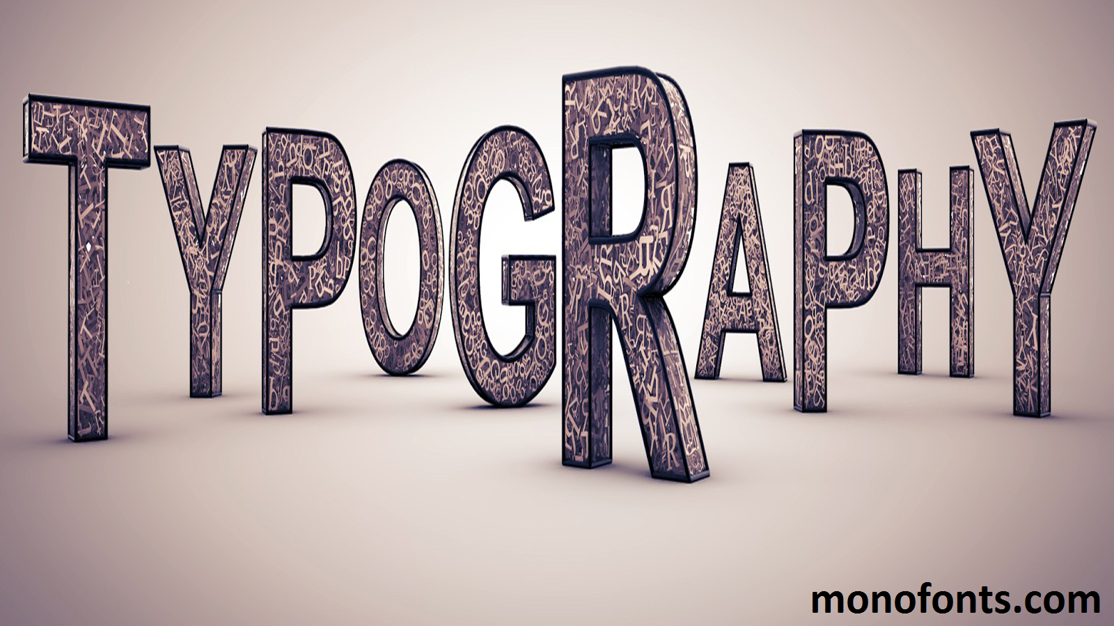
source: www.monofonts.com
Apakah Anda mencari informasi tepat untuk 4 cara membuat tipografi? Tidak perlu mencari lagi banyak alternatif kualitas tinggi. Kami memiliki apa yang Kamu butuhkan.
Informasi yang Kamu cari, seperti 4 cara membuat tipografi, beragam pilihan tersedia disini yang sempurna untuk minat semua orang. 4 cara membuat tipografi koleksi kami ialah cara yang cocok untuk mendapatkan pilihan apa yang trending. Jadi kenapa harus menunggu? Unduh ide Anda dan ekspresikan sisi petualang Anda hari ini! Kami harap artikel 4 cara membuat tipografi diatas bisa bermanfaat .